(29 August 2025)
BRINGING HOSPITALITY HOME: A STORY BEHIND CRIMSON
When Gables Residential invited us to develop the brand for their most exclusive luxury rental property in Houston, it was clear this wasn’t going to be just another high-end apartment complex. This was their flagship offering—something rare, refined, and wholly uncompromising. The vision? A brand with the soul of a boutique hotel: intimate, cinematic, and built around a standard of service that whispers rather than shouts.
This wasn’t simply branding an address. It was curating an experience.
We began where every great story begins: with a name. Crimson—a single, evocative word that conjures depth, desire, and elegance. It carries the weight of a velvet curtain drawn back to reveal something exclusive, a little mysterious, and deeply personal. From that moment, Crimson became more than a project. It became a world we would design in full.
Instead of traditional real estate branding tropes, we looked to the language of couture and private clubs. The logo mark—fluid and sculptural—was inspired by fashion labels and perfume houses. It’s a symbol that could just as easily live on fine leather as it could on brushed metal signage. Everything was designed to signal rarity and restraint, with a modern edge.
The color palette leaned into rich emotion: crimson reds, inky blacks, and soft metallics that shimmered in low light. We avoided anything overly glossy or expected. This was not a showroom—it was a sanctuary. Every visual decision was made to evoke drama and intimacy, like a dimly lit speakeasy or a velvet-lined theater.
What set Crimson apart wasn’t just aesthetics—it was the philosophy behind it. We approached this not as a residential development, but as a hospitality brand. That meant treating every touchpoint—from the welcome materials to the digital experience—with the care and intentionality of a five-star hotel.
Our team developed campaign language that wasn’t just descriptive, but magnetic. Bold, refined, and assured, the tone didn’t sell features; it sold a feeling. The tagline captured this spirit perfectly: “To live in a color so vivid is to live a spectacular life.”
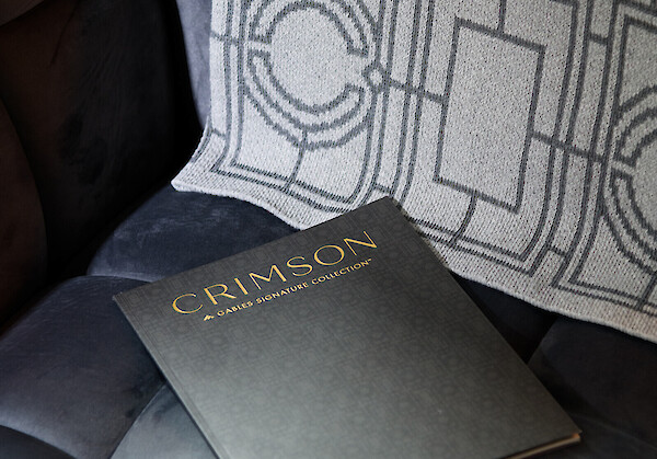
The storytelling extended far beyond logos and colors. We produced a printed piece that felt more like a high-end fashion editorial than a brochure—complete with moody, cinematic photography, layered layouts, and custom typography. The digital experience followed suit: seamless, immersive, and tailored to a discerning audience used to booking vacations, not leases.
Even the packaging—whether welcome gifts, residents' keys, or service correspondence—was designed to elevate the everyday into something worth remembering.
With Crimson, we helped Gables Residential reimagine what a luxury rental could be—not as real estate, but as a destination. Every choice, from typography to tone of voice, from scent to service philosophy, was made with one goal in mind: to create an atmosphere of understated luxury and personal sanctuary.


